 Patrick Dean Hubbell is a relatively young artist but his art feels mature. That’s a pretty cliché way to start an exposé of an artist you actually admire. Might even be a bit belittling. Sorry Patrick Dean Hubbell, I’m not good at intros! What I mean to say is that a lot of thought and consideration seems to have gone into Dean Hubbell’s art. I respect that. Now, to get through this introduction as smoothly as possible, let’s stick to some facts. Patrick Dean Hubbell is Navajo. He graduated art school 2010. He lives and works on the Navajo Nation in Window Rock, Arizona.
Dean Hubbell’s art is not easy to categorize. It is part disciplined geometric control and part total painterly abandon. It feels traditional and new at the same time.
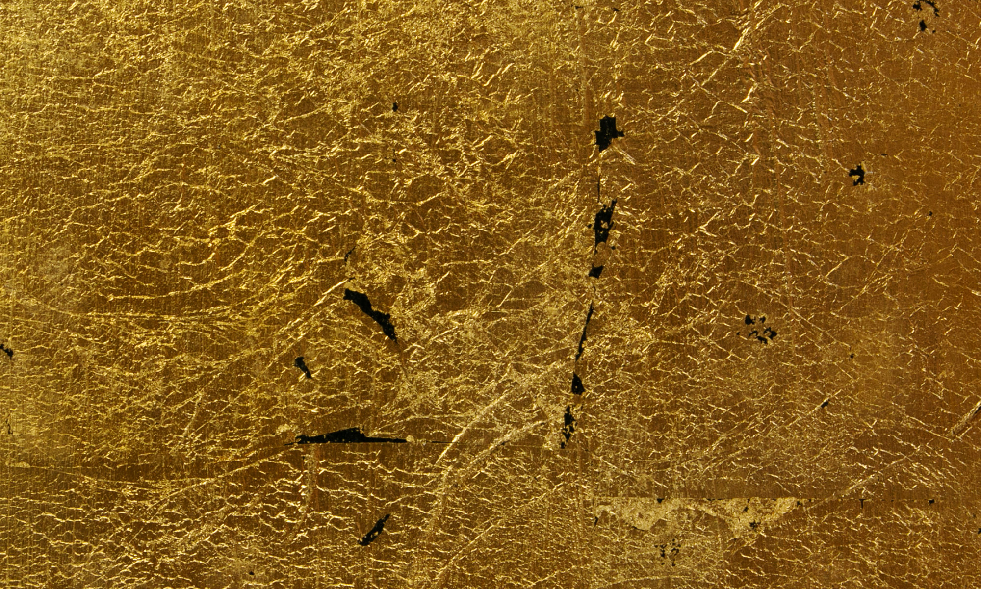
One gets the feeling that Dean Hubbell is somebody who follows his own path. But sometimes he veers close to others. One of Dean Hubbell’s main inspirations is Jackson Pollock. It was not a connection I had spontaneously made but when I came across a video of Dean Hubbell talking about his admiration for Pollock it made perfect sense. Pollock was, of course, famously inspired by Navajo sand painting, so Dean Hubbell’s admiration of him closes a circle of sorts. But that is only a superficial kinship. The spirit of Pollock can be traced deeper, in the way Dean Hubbell works and thinks about his work. In the same video, which can be seen on the artist’s webpage, we see Dean Hubbell crouched down on the ground, gathering soil from his native, Navajo land. He will use it as pigment for his paintings. Like Pollock, Dean Hubbell lays his canvas flat on the ground and proceeds to rub the processed reddish soil into the canvas. While being largely abstract, Dean Hubbell’s art in this way manages to address questions of belonging and identity in a way that goes beyond representation. There is something profoundly moving in knowing that the artist’s homeland is physically present when the viewer encounters the painting in the gallery. Such indexes of artistic presence can also be experienced in Pollock’s work, which sometimes includes cigarette ashes and footprints and whatever gravity decided fit for it’s pull.
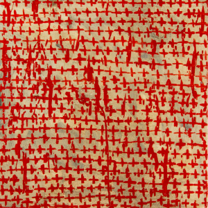
Important though his influence may be, I would say that Dean Hubbell’s affinity to Pollock is only half the story. For where Pollock welcomed chance and accident as part of his creative process, with Dean Hubbell there is often a force to counteract the uncontrolled and chaotic. With an eye for strong patterns and graphic clarity, Dean Hubbell’s painting often juxtapose Pollockian turbulence with geometric repetition. A definite favourite of Dean Hubbell’s is the zigzag, or chevron, pattern. I appears as a leitmotif throughout many of Dean Hubbell’s series of painting.
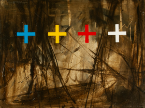
Dean Hubbell likes to work in series and he handles the format like a virtuoso. The musical connotation of the latter term is intended in every way because within the context of the series each painting becomes different notes on the same theme, each contributing to the melodic whole. Another analogy is to film. The presentation of the series “Between Here and There” on Dean Hubbell’s website could almost be stills from a short, abstract movie in the tradition of, say, Stan Brahkhage. The series starts out with a strict chevron pattern against differently coloured backgrounds. After a few paintings, the pattern is upset and becomes looser and apparently more and more haphazard. Eventually the pattern is all but dissolved into a flurry of coarse brushstrokes and abstraction. The pattern appears again, but this time more angrily, almost brutally.
While each painting is completely spectacular on their own, I cannot stop replaying this series as a sequence in my head, and it is a trip!
Since we have opened the door to film, let us use some of its’ concepts to cast light upon another series.
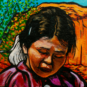
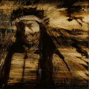 The series “Almost a Portrait” consists of obfuscated figures. They can be identified as Native American from their ceremonial clothing and other traditional markers of Native identity. Dean Hubbell states that the paintings are based on traditional portraiture and how those practices were seldom “in the best interest of” Native American peoples. There is indeed something “off” about these images. This impression is further supported by their “bad framing”. The framing makes it appear as if these were pictures taken by accident, as when the shutter goes off in between changing camera position. French film theorists referred to such “badly” composed images as “decadrage” which roughly translates as “deframing”. Some New Wave filmmakers consciously used deframed images as a way to make the spectator aware of the frame and more generally to reflect upon the constructed nature of representation. It functions similarly in “Almost a Portrait”. By literally pushing subjects out of the frame, these images signal that proper representation is not to be found here and that the truth lies elsewhere.
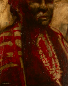
Patrick Dean Hubbell spent the whole of 2017 travelling around the Navajo Nation to collect earth pigment to use in his painting. Some of these paintings have been on displayed until recently at Peter’s Projects in Santa Fe.
As one of the most exciting contemporary artists, Kiva Gallery can’t wait to see what Patrick Dean Hubbell will do next. Kiva Gallery is also proud to include a number of Patrick Dean Hubbell’s paintings in its collection.
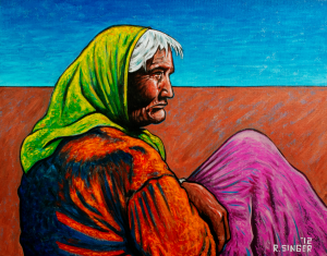
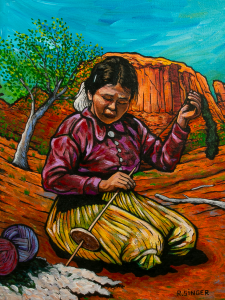 Kiva Gallery also has another Ryan Singer painting with an unusually serene mood. It is a deceptively simple scene. But if you allow it, the outline will tell a deeper story about time and stasis, tradition and generational renewal. Again, it’s a painting of a woman in a landscape. In contrast to the woman above, this woman is young. Her activity, however, is old. She is spinning wool. The landscape around her seems to respond to her activity because it curves around the girl almost to envelope her. But there is that thick outline again, tracing the contours of the girl’s body and shielding her off from her surroundings. It is almost as if the landscape is moving more than she is. A strong outline reifies movement rather than capture it. In a way it stops movement and freezes it which makes the experience of superhero comics, which are of course full of movement, deliciously paradoxical. The girl spinning wool seems remarkably still despite being caught mid-motion. From the perspective of her activity, time has stopped moving. The girl probably learned how to spin wool from her mother, and she in turn will teach her daughter. The activity doesn’t belong to her, she belongs to the activity that has existed before her and will continue to exist long after she is gone.